New Project: Cognitive Architecture Thinking Book Design
Take a peek into our approach to typography, layout and design for this new book, coming soon
Cognitive Architecture Thinking uses an airy prose style to lay-out a unified framework for how to go about forming thought patterns that are at once gracious, individuated, and sustaining. At a high level, this book is a comprehensive treatise on taking ownership of mindset – despite whatever chaos may be going on in the world – breaking-down a complex topic into bite-sized food for thought.
Having known the author for many years may, perhaps, endow me with a unique insight into what is otherwise an abstract and conceptual – albeit structured – way of thinking about thinking.
Meta.
Indeed, the book will undoubtedly appeal to audiences with a penchant for modern philosophy and metacognition.
In my mind though, the real topic at the heart of this inquiry is an exploration of a deeply and uniquely feminine superpower: coping – doing and dealing with hard stuff as we untangle the messiness of life and navigate a never-ending web of relationships. At the end of the day, it seems to say, “You are in control, and you have the power to tame the chaos.”
Intentional Choices. Purposeful Outcomes.
Of course in a long-form text such as this the goal is, first and foremost, legibility and a comfortable reading experience – to which serifs are generally lent because they help anchor the eye along a horizontal line. In selecting typeface pairing options to present to the author, I sought to achieve balance between broaching a daring topic and elevating the author’s unique perspective through crafting an unimposing underlying visual structure.
We seized an opportunity to break from typesetting norms in book design – default typefaces we typically see used, such as Baskerville, Garamond, Georgia, Times New Roman, and the like – and form a more exceptional identity for what is the first in a series of Cognitive Architecture Thinking books.
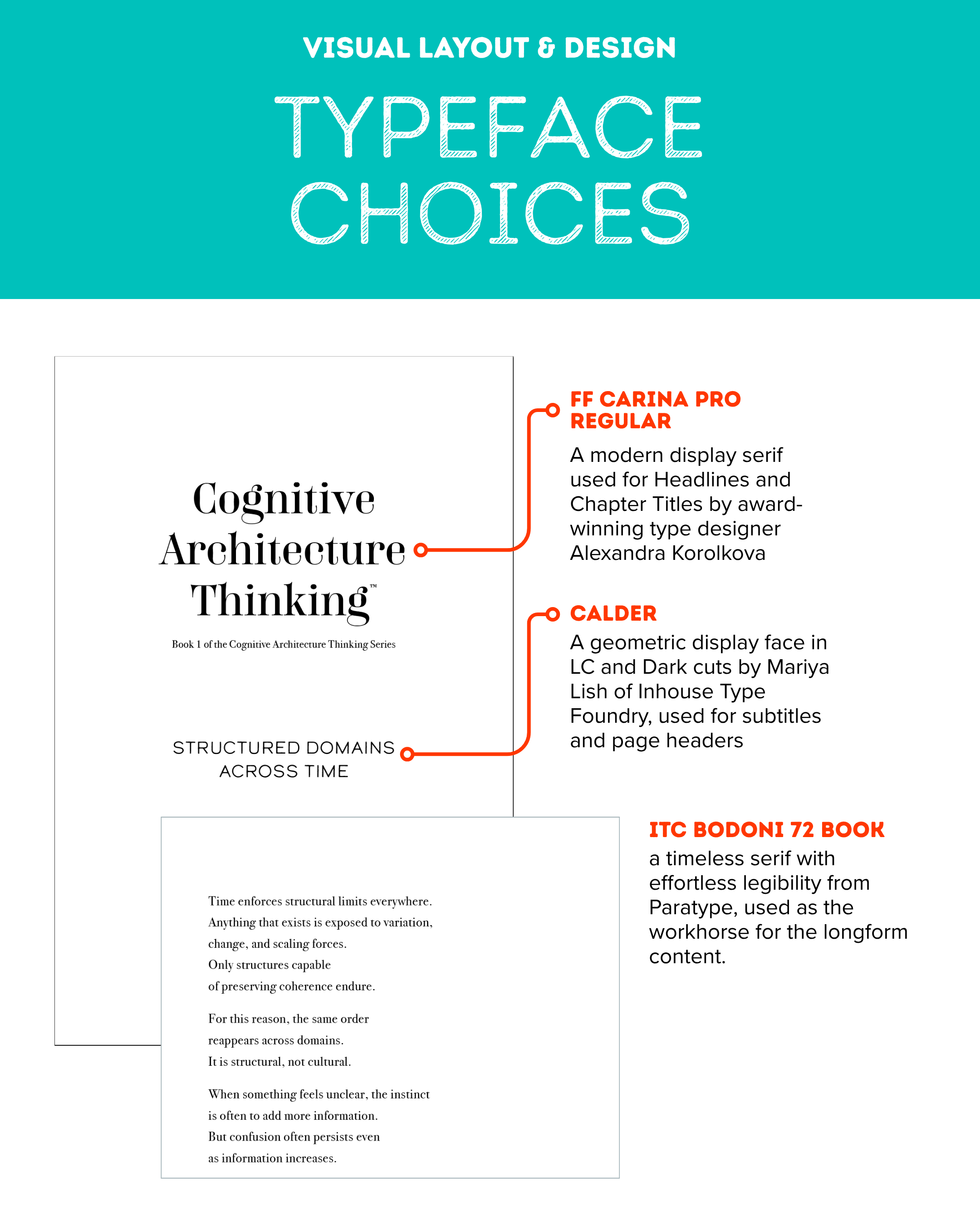
Typeface choices for the Cognitive Architecture Thinking book series.
For titles and the byline, we selected the beautifully unique modern display serif by award-winning type designer Alexandra Korolkova, FF Carina Pro Regular. Carina, introduces a bit of sophisticated flair with its high-contrast line work – yet avoids feeling overdone.
For subtitles and subheaders, we paired Carina with a distinctive contrasting typeface – geometric display face Calder in LC and Dark cuts, by Mariya Lish of Inhouse Type Foundry. Calder is a contemporary sans serif whose simplicity and slight curves provide a nice balance to the stylized swashes of Carina. Describing the intent and inspiration behind Calder, the type designer writes, “Calder began as a personal experience and endeavour to express and share the spirit of adventure.” Fitting.
And lastly, for long-form text, we leaned on a classic beauty – the workhorse ITC Bodoni 72 Book from Paratype – a timeless serif with effortless legibility that echoes the style and flair of Carina, though slightly more restrained.
Creating an Enjoyable Reading Experience
Deeply thoughtful topics like Cognitive Architecture Thinking beg for ample space and time to digest – it was this core need which directly inspired our approach to its type choices, layout and design. The prose itself takes on a quasi-poetic form that progressively reveals groupings of ideas which create the scaffolding for the big idea: every individual has the power to impose structure where it is lacking.
As such, the visual presentation embodies this thought by way of careful attention to white space, including the line balance (ragging) of each paragraph, and line spacing (leading), avoiding “rivers” of whitespace from line to line, and paragraph to paragraph. The visual silhouette on the right side purposefully makes each line end flow neatly into the return sweep.
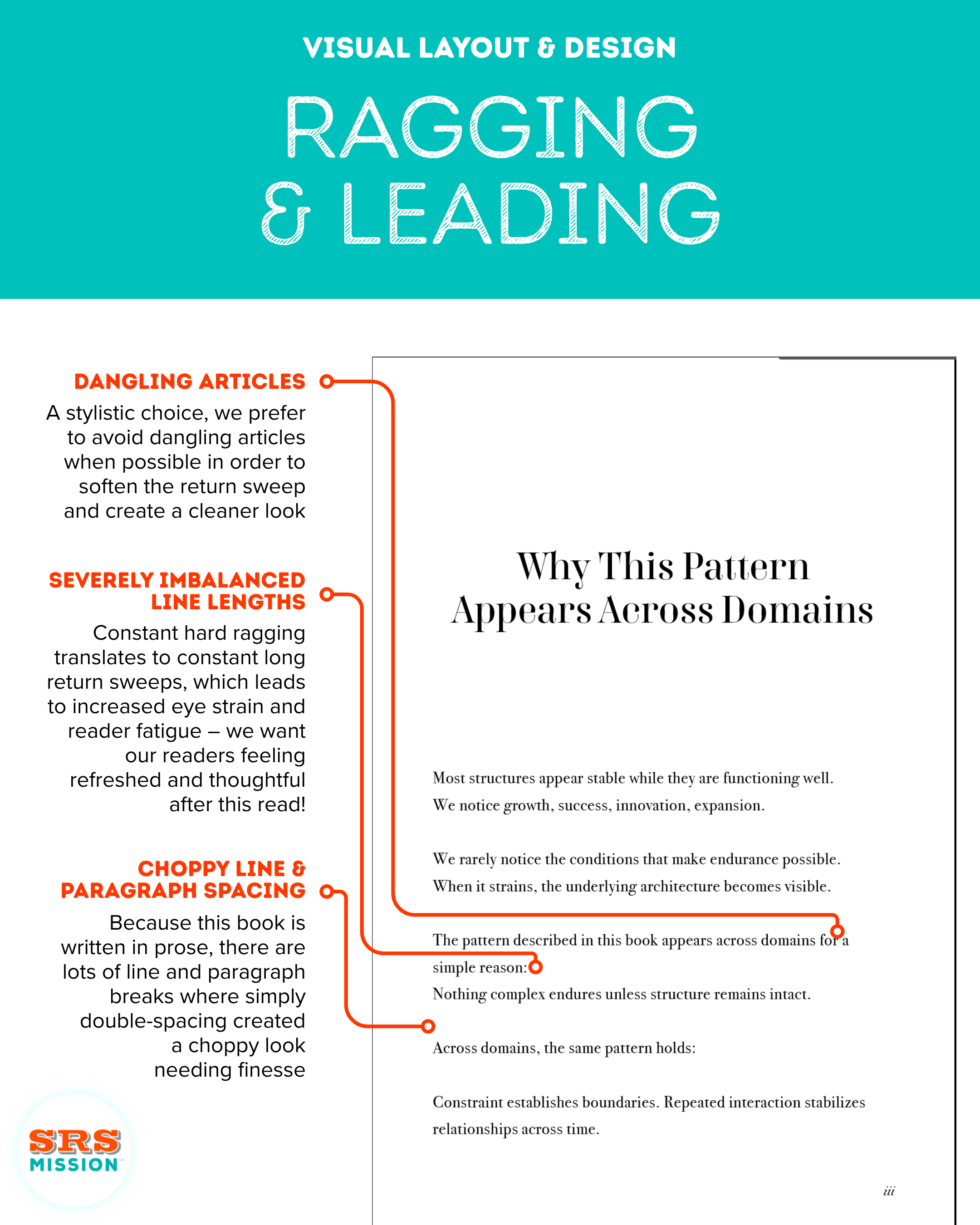
Page iii of Cognitive Architecture Thinking, before ragging and leading were applied.
Terms to Know
Ragging is the line length in relation to the following lines which comprise a paragraph. When balancing a paragraph’s ragging, we aim for line-length to be as equal as possible in order to shorten return sweep, while also accounting for other factors like reducing or eliminating dangling articles, widows and orphans.
Return sweep is the distance the eye must travel when your eyes jump from the end of one line to the beginning of the next. A long-form text full of choppy long-line to short-line return sweeps can lead to eye strain and fatigue, so we try to keep return sweet as soft as possible for a pleasant reading experience.
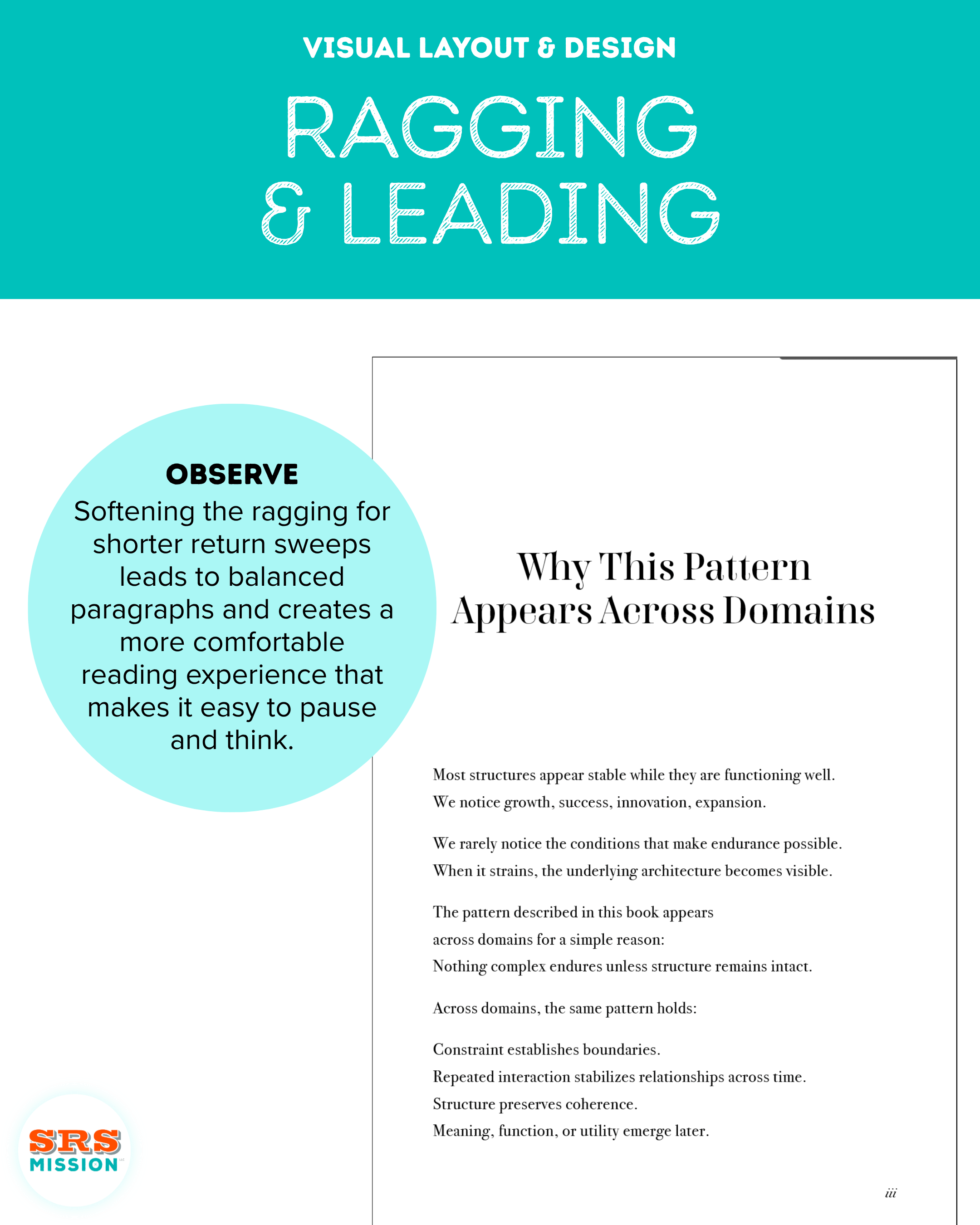
Page iii of Cognitive Architecture Thinking, with ragging and leading applied.
Of course a myriad of design decisions were involved in crafting this finished piece for Ms. Adams, and we’re proud to finally share our work on this project! Do you have a point of view on the typeface selections? Is there anything you would’ve done differently? We’d love to hear your thoughts.
Cognitive Architecture Thinking Book 1 is a perfect-bound paperback and its forthcoming release is scheduled for August 4th.