
Texas Chili Queens Brand Identity
Slinging Chili, With a Twist
Founder Ed Hambleton dug into his San Antonio roots and LGBTQ+ advocacy to come up the concept for his Texas Chili Queens food truck — and we created branding to celebrate the spirit behind this operation.
Type Studies &
Hand-crafted Lettering
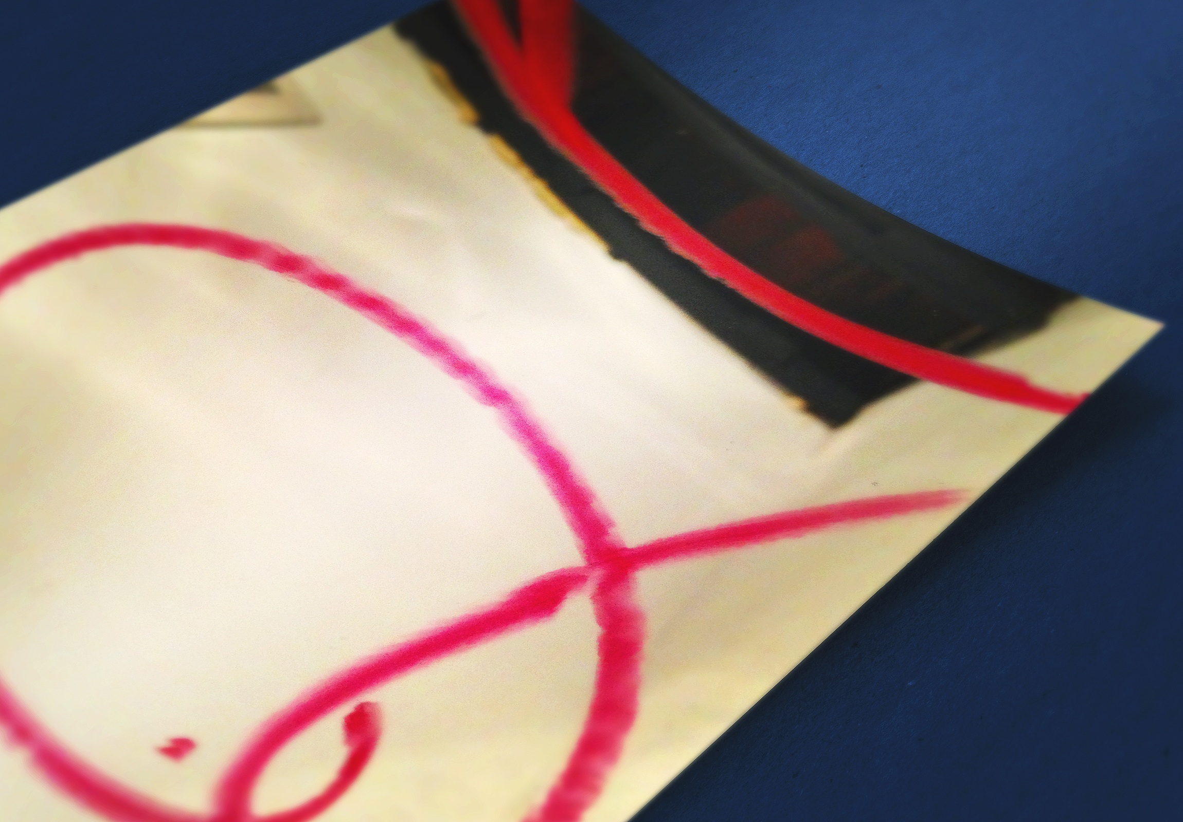
We couldn’t find a perfect typeface to capture the essence of “Texas Chili” and “(drag) Queen” — so we hand-drew it… in lipstick… on a mirror. The Q is a lasso that marries the concepts of Texas Chili and Queens.
Logo
Design
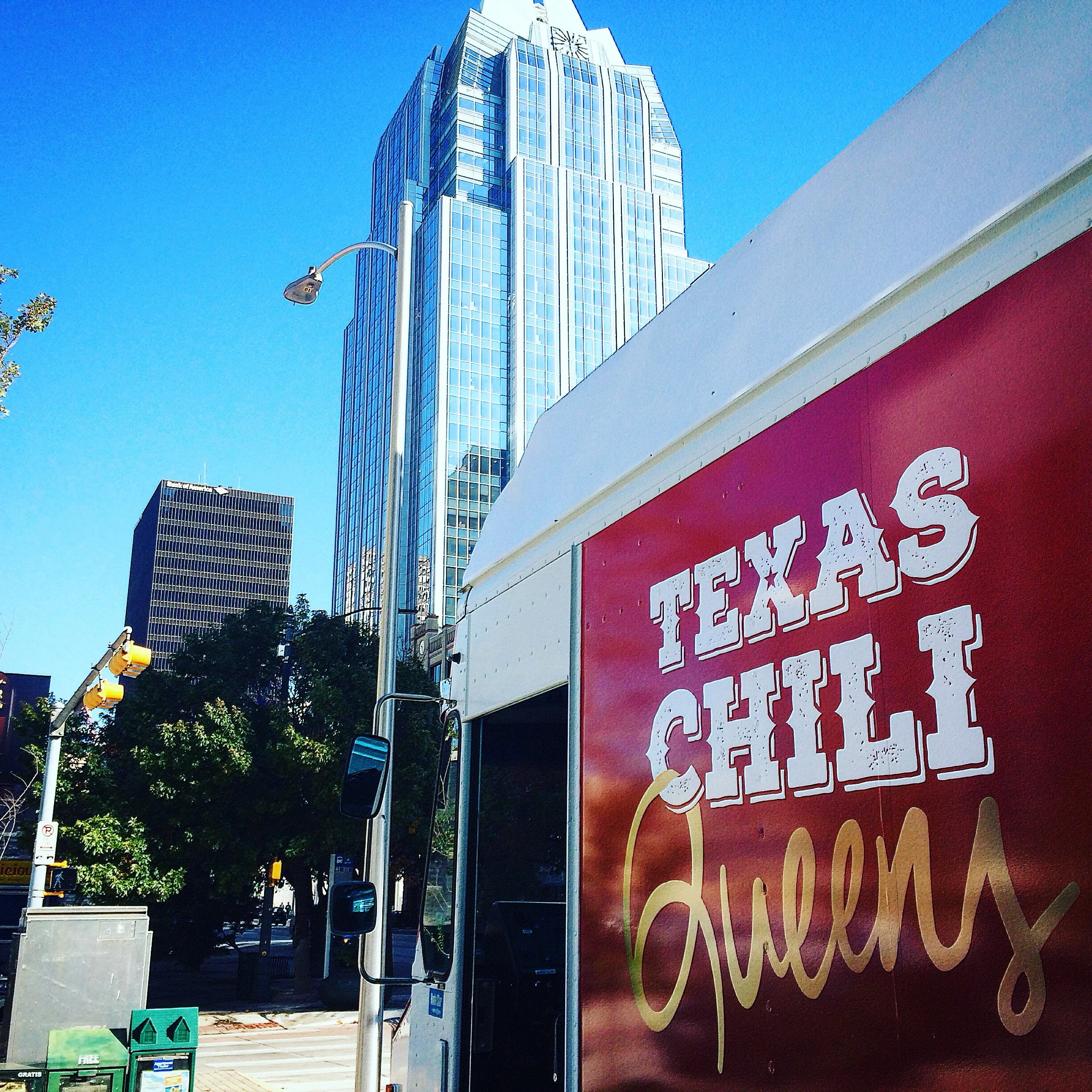
We paired the hand-drawn “Queens” with a distressed slab serif typeface, a deep chili cayenne red plus metallic gold shimmer, and the perfect branding for this food truck was born.
Truck Wrap, Menus, Business Cards & More
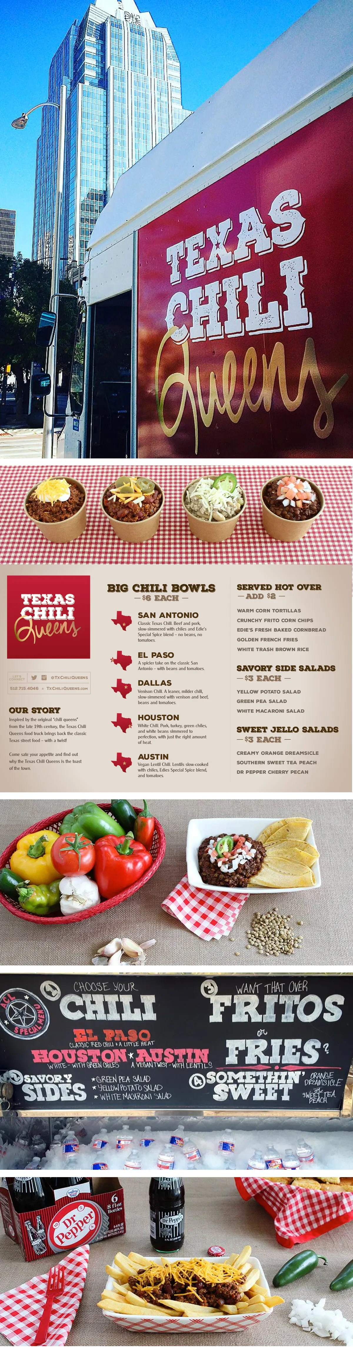
We crafted a variety of different materials for cohesive branded visual system across the mobile storefront, menus, business cards, website, merch, and more.
And a peek behind-the-scenes at the work & deliverables
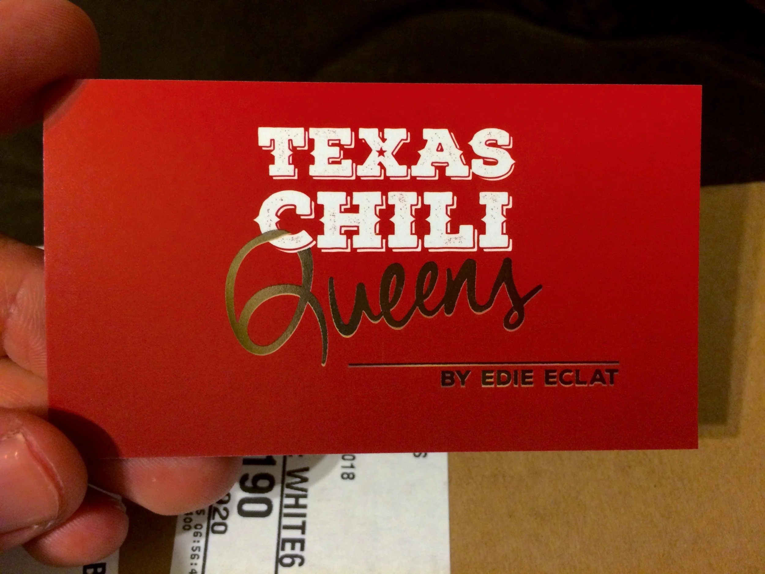
Texas Chili Queens Business Card Gold Foil Stamped
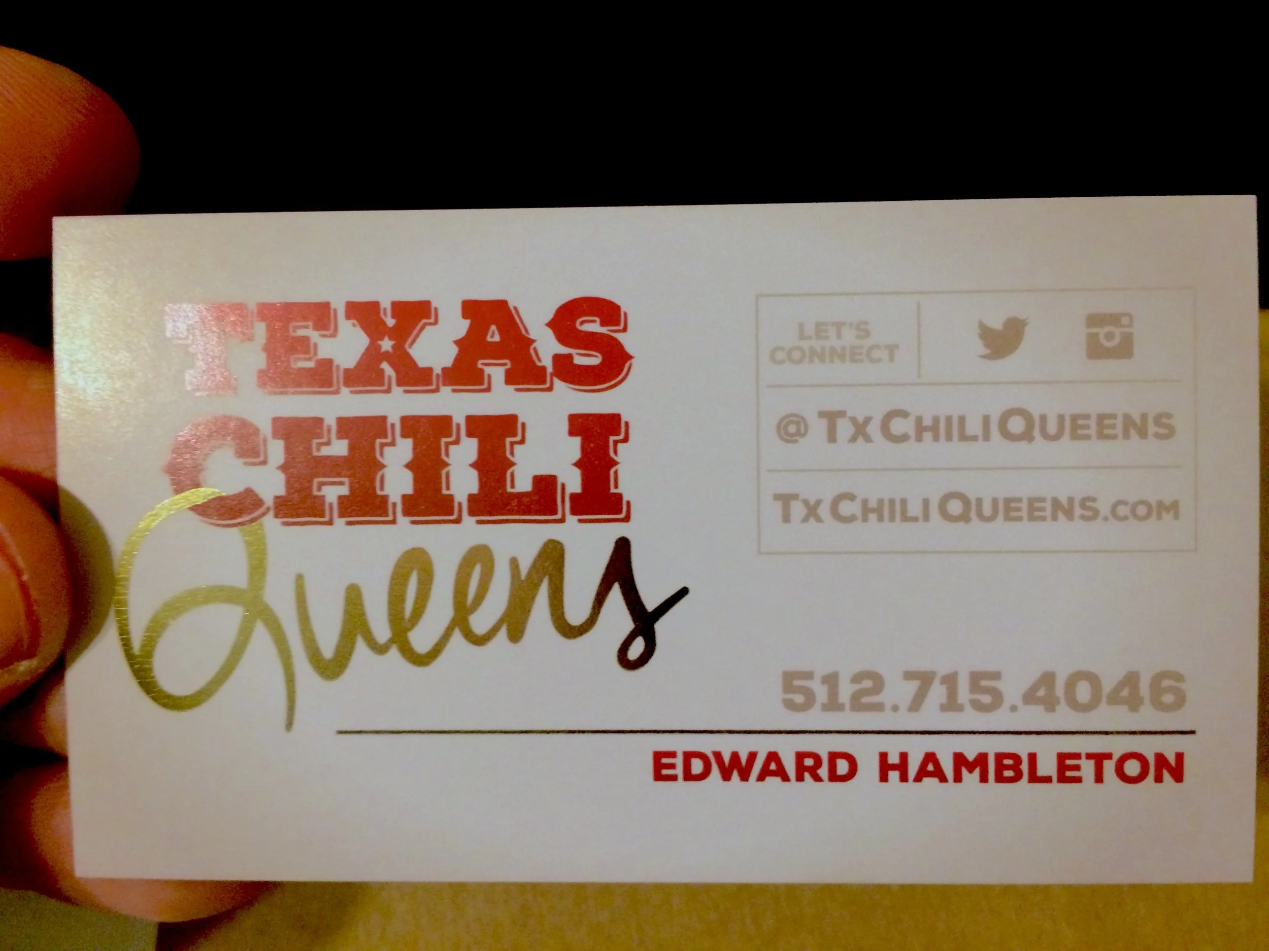
Texas Chili Queens Business Card Gold Foil Stamped
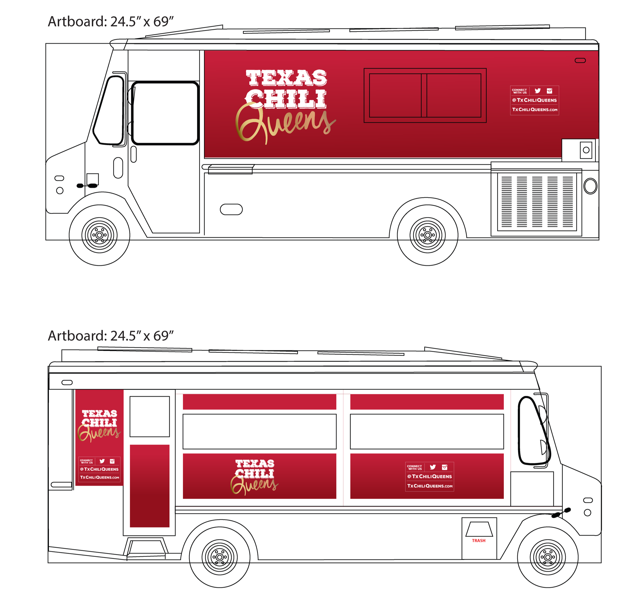
Texas Chili Queens Food Truck Vinyl Wrap Schematic

Texas Chili Queens Food Truck Vinyl Wrap
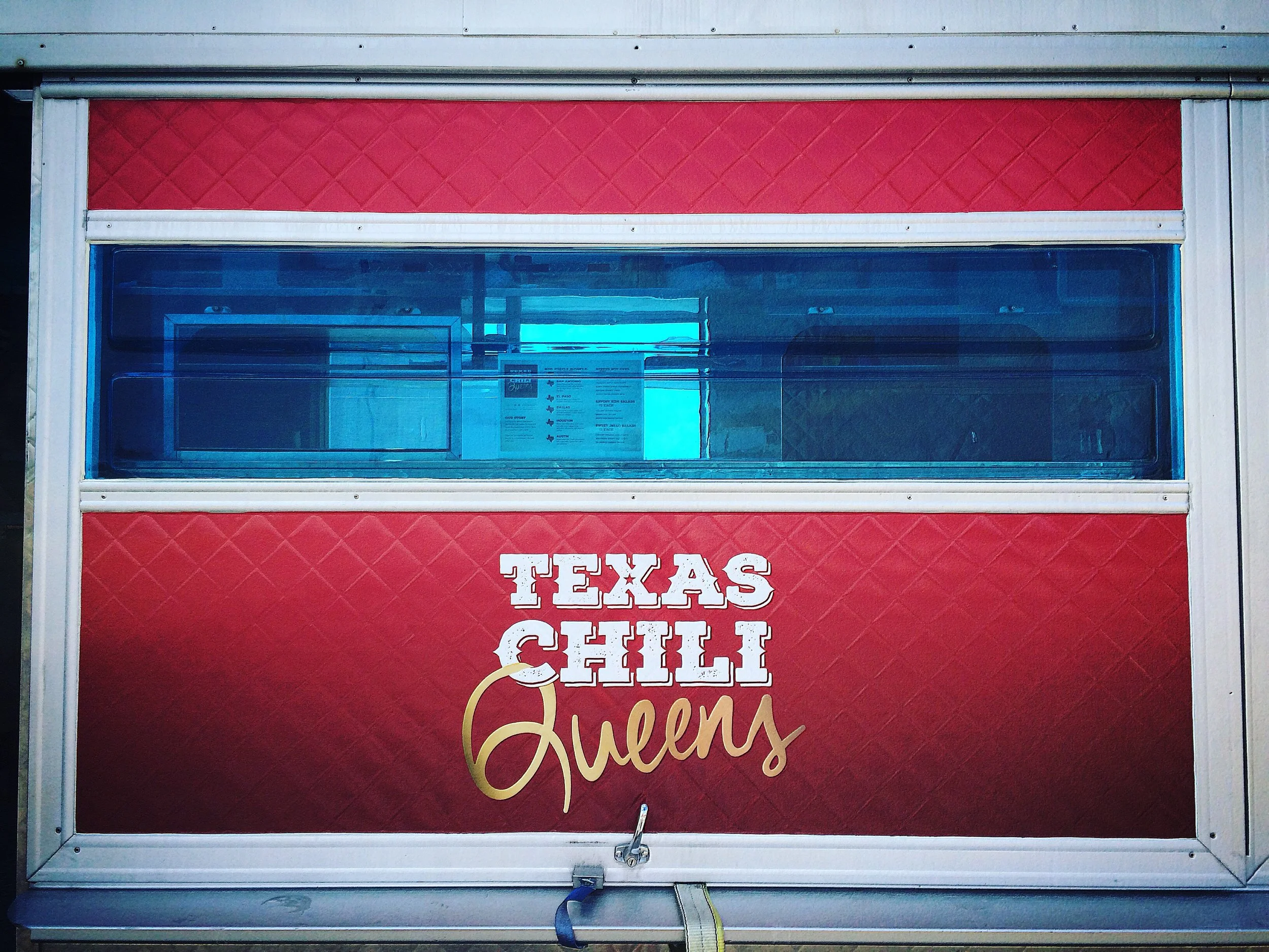
Texas Chili Queens Food Truck Vinyl Wrap
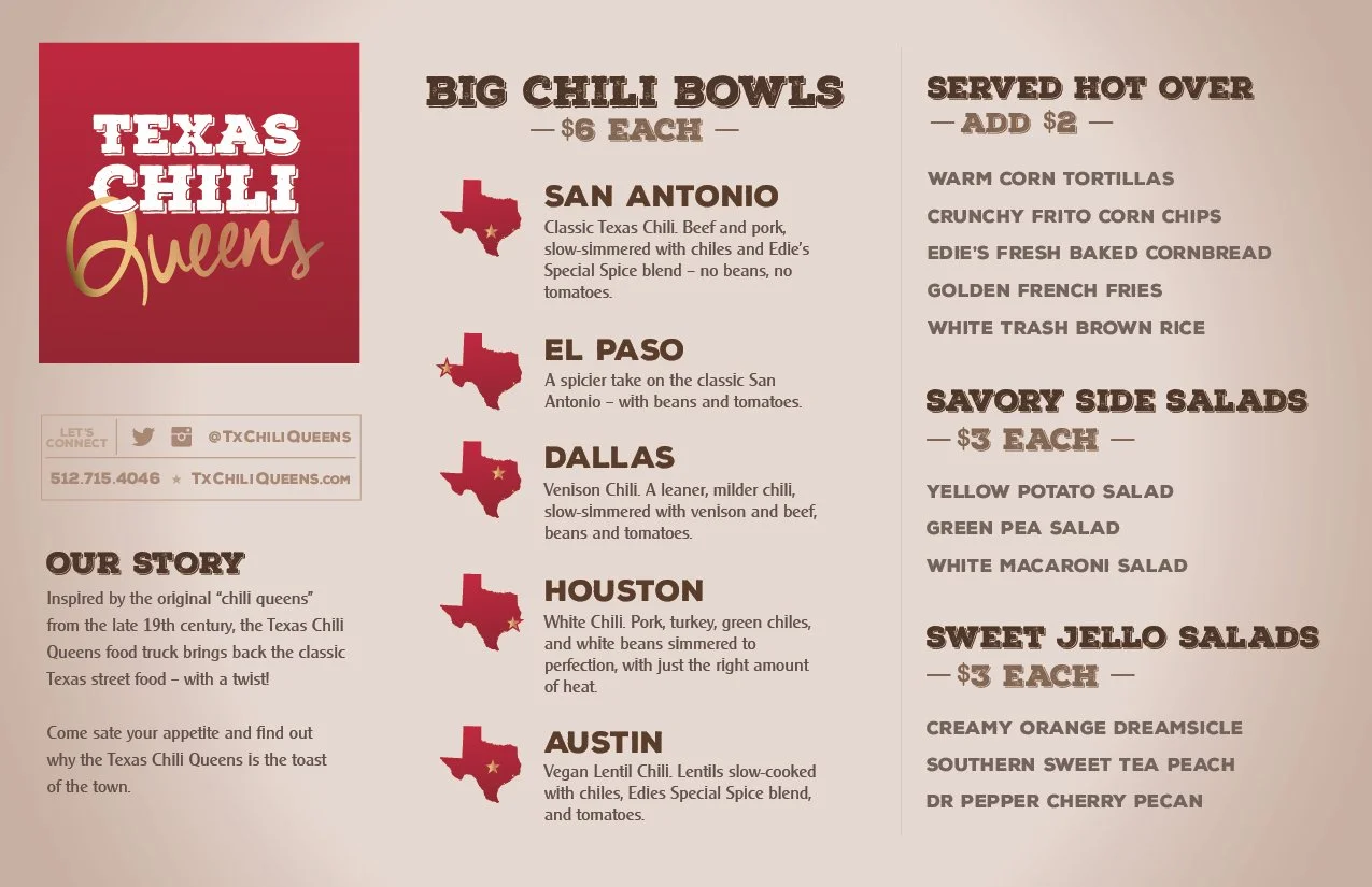
Texas Chili Queens Menu Cards